Official Marks
Presenting a unified appearance across the Rice University campus is important for maintaining Rice's reputation as a leading educational institution.
All logo configurations (Primary, Secondary and Tertiary) are available for download in approved colors for light and dark backgrounds at bit.ly/university-logos.
Logo Hierarchy & Orientation
Identifying the logos hierarchically will help ensure the appropriate usage for the audience and available space. Identifying the logos will also be key for our minimum size requirements section.
Primary Identity
Preferred Mark
Including the word "University" provides essential context, ensuring our identity as a premier academic institution is clear to all audiences.

Secondary Identity
Horizontal or Vertical
The wide-format version is the preferred choice for website headers, letterheads, or any application with limited vertical height where the full institutional name is still required. The vertical version features the shield directly above the wordmark. Reserved more for items where a vertical orientation is required due to narrow space constraints like pull-up banners.


Tertiary Identity: Wordmarks for limited space
The Utility Mark. This shield-less version is available for specialized layouts where space is extremely limited or for a minimalist aesthetic where the shield may become illegible. It is available in both vertical and horizontal (one-line) versions.


The Spirit Mark: Rice (Shield + Abbreviated Wordmark)
This version omits "University" and is reserved for internal audiences or contexts where the Rice brand is already firmly established (e.g., campus signage or student merchandise). It should be used sparingly.

Downloads and Color Usage
All approved logo configurations are available for download at bit.ly/university-logos.
To maintain brand integrity, please select the file appropriate for your background:
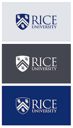
Light Backgrounds: Use the full-color or navy logos.
Dark Backgrounds: Use the "reversed" (white) versions to ensure high contrast and legibility.
Important: Do not attempt to crop, deconstruct or recolor the logos. Always use the provided files to ensure the shield and wordmark maintain their correct proportions.
Minimum Size and Legibility Guidelines
To maintain the prestige and clarity of the Rice brand, the word "University" must remain legible in all applications. If the logo is scaled down too far, the fine details of the shield and the secondary text are lost. To maintain professional standards, follow these minimums:
Print: The Primary Horizontal logo should be at least 1.5 inches wide.
Digital: The Primary Horizontal logo should be at least 150 pixels wide.
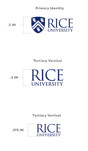
In the event that the logo won't work on certain small imprint areas such as pens, you may spell out the name of your department in one of the approved sans serif fonts (Mallory or Lato).
Clear Space Requirements
To maintain the integrity and visual impact of the Rice brand, our logos must always be surrounded by a minimum amount of "clear space." This ensures the mark remains unobstructed and prominent, regardless of the background or surrounding elements.
The "R" Rule
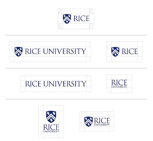
The required clear space is determined by the width of the "R" in the Rice wordmark. This measurement scales proportionally with the logo:
Minimum Clearance: There must be a clear zone on all four sides of the logo equal to the width of the "R."
No Encroachment: No text, photos, page edges or other graphic elements should ever enter this zone.
Refer to the visual examples below for a demonstration of how to calculate this space using the "R" as a measuring tool.
Use of Internal Logos
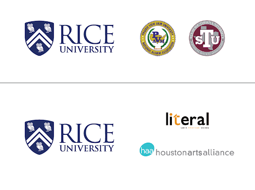
The Rice community collaborates on a variety of programs, research, events and conferences that may create a need for co-branding with other Rice schools, institutes and programs.
1. If co-branding with a campus program or initiative that does not use one of the identity lockups, both brands should be placed side-by-side and follow space and size requirements.

2. When two schools are partnering, we recommend placing the logos side-by-side using the minimum space requirements.

3. When multiple schools are partnering, guidelines recommend using the main Rice logo and listing the names of schools, etc.

4. Do not combine the logos to create a new version.
Logos vs. Graphics
Most Rice schools and units qualify for official lockup logos, which must be used across all signage, digital and print materials to ensure cohesive messaging.
Non-branded graphics are only permitted for temporary events or short-term initiatives. No other graphics should ever replace an official logo.
External Logo Usage
Rice departments collaborating with external organizations must protect the university's identity by following these visibility and placement rules:
Clear Space: The Rice logo must be surrounded by a minimum clear space equal to the height of the shield's owl. No text or graphics may enter this area.
Size: The shield must be at least 0.5 inches tall, or equal to/greater in height than the largest external logo.
Positioning: When displaying multiple marks, place the Rice logo first or last for maximum visibility.