The Colors of Our Campus
Built from the university core colors, and expanded with colors sampled from the natural beauty of our campus, the university color palette helps bring life to your designs. The campus color palette is a robust system designed to enliven your communication. The palette is capable of a variety of expressions, but it’s important that color use is carefully managed within Rice-branded applications.
Primary Colors
The primary colors of Rice are blue and gray, selected in 1912 by Rice’s first president, Edgar Odell Lovett. In addition to these core colors, an extended range of university colors seen on the Rice campus have been added to the color palette as part of the overall brand.
Logo Colors
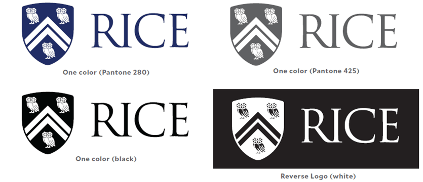
Print the Rice logo in four-color process, Rice Blue (Pantone 280) or Rice Gray (Pantone 425). One-color black is also acceptable. Do not apply any other colors.
Blue displays differently on computer screens. For website color application of Rice Blue, use Hex 00205B or an RGB translation of 0, 32, 91.
Dark themes
To print the logo on a dark background, use the inverted version, with the Rice wordmark in white. All versions of the official Rice logo can be downloaded at bit.ly/university-logos.

Tints
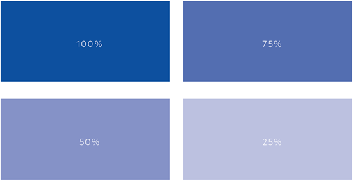
The extended blue and gray palette has a range of light colors. In the event a lighter color is required, the base color can be tinted by lowering the opacity over a white background. Using opacity changes over white to lighten colors will prevent hue and saturation changes.

Secondary Colors
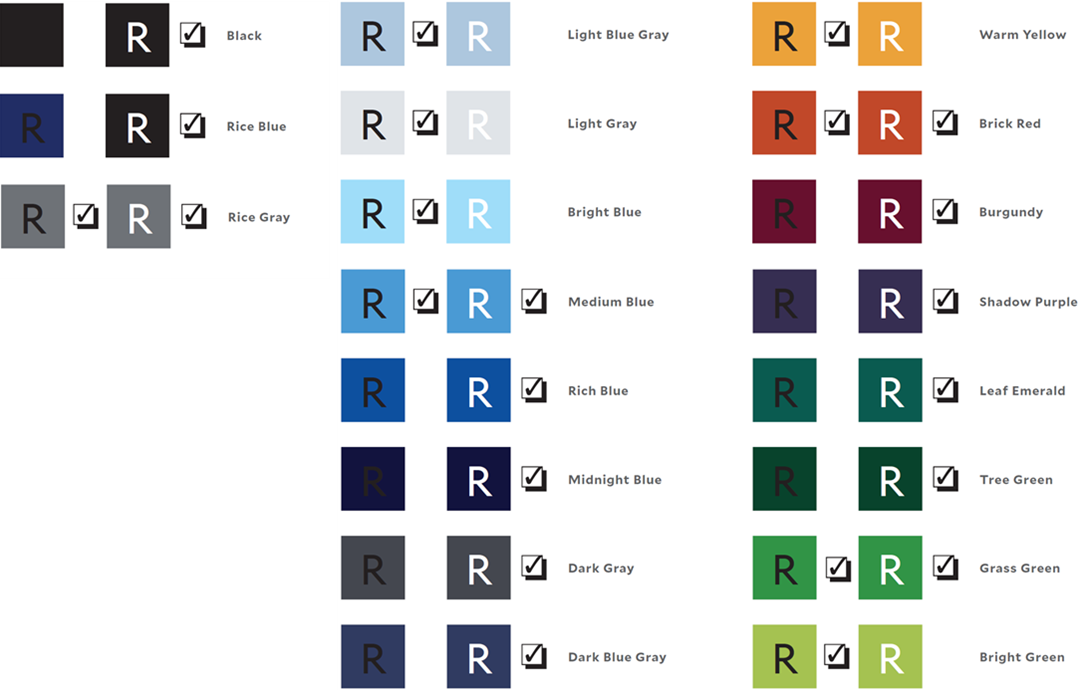
The extended Rice color palette is designed to enrich the core palette by providing a harmonized set of colors. The recommended use of the extended palette is to use two of the colors, one from the darker end of the color set paired with a color from the lighter end. Using all of the colors is not generally recommended.
Accent Colors
The secondary set of colors was designed to allow for a greater variety of color application while still complementing the core university colors. The recommended usage of these colors is that they are to be used as accents or background colors, not in place of the core university colors.
Web Interactive Colors
For web applications and digital media, the information below shows the Rice color palettes and the accessible font color configurations, represented by a check mark, as defined and legally required by Web Content Accessibility Guidelines (WCAG).
AA-Compliant Color Formulas for Screen Applications
By ensuring adequate contrast for text and visual media, we can help people with visual impairments navigate content more easily. The Web Content Accessibility Guidelines (WCAG) provide a set of international standards developed by the Worldwide Web Consortium (W3C), the governing body of the web.
AA-level compliance is an important standard of contrast for displaying text and images, in both the foreground and the background. The goal of these accommodations is to help ensure that our online content is equally accessible and user-friendly to all users.
Please visit the Rice Accessibility Program and Rice Web Accessibility Policy for more information. For web development services, see Public Affairs.

